RESHAPE THE CONTOURS OF A PROPERTY DEVELOPER
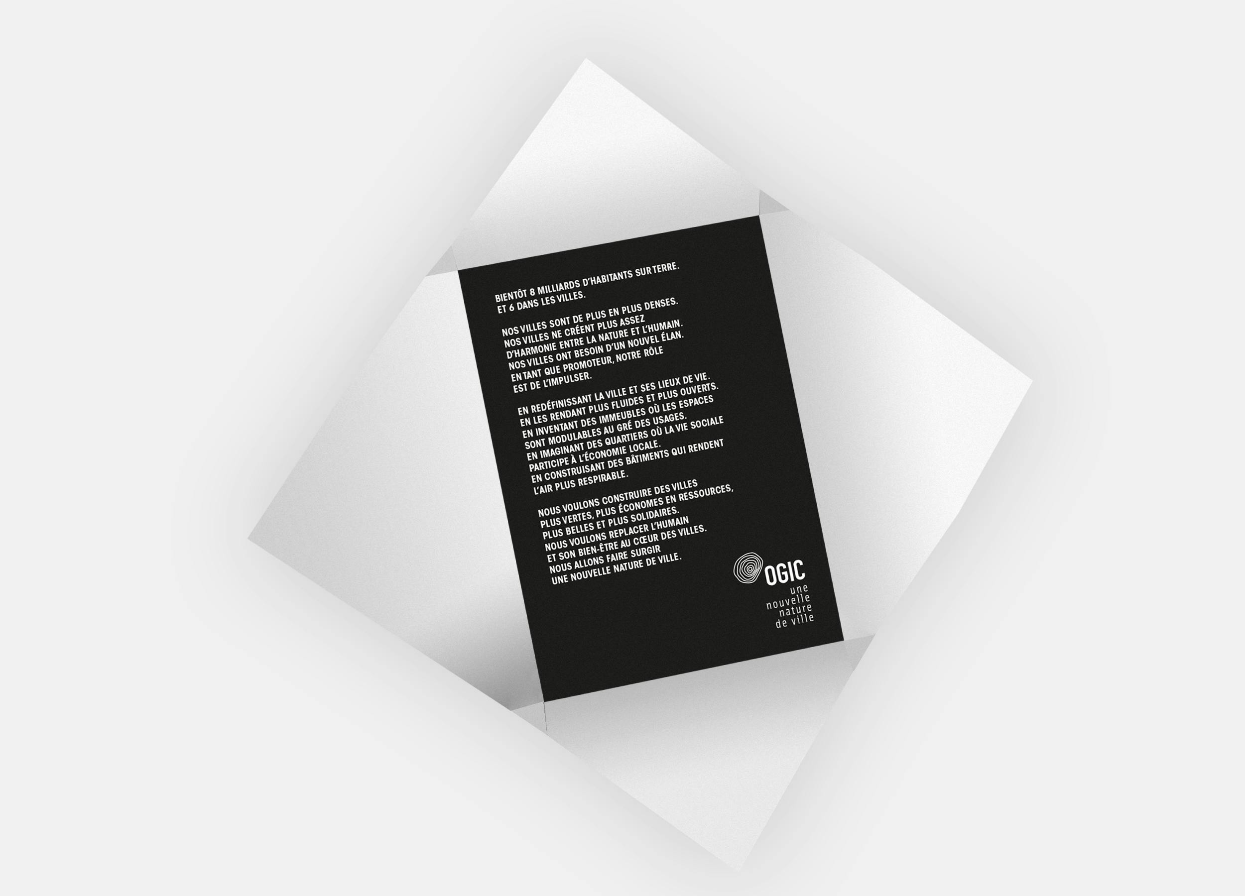
Render the city more fluid and more open.
Create living and leisure areas adaptable to different uses.
Develop neighborhoods where social life is intrinsically tied to the local economy.
Construct buildings that make the air more breathable.
This is what the job of a property developer looks like today. A pivotal change that OGIC, a major player in French property development, had already incorporated into its projects. And a change that was high time to communicate.
CITY OR NATURE, NO NEED TO CHOOSE
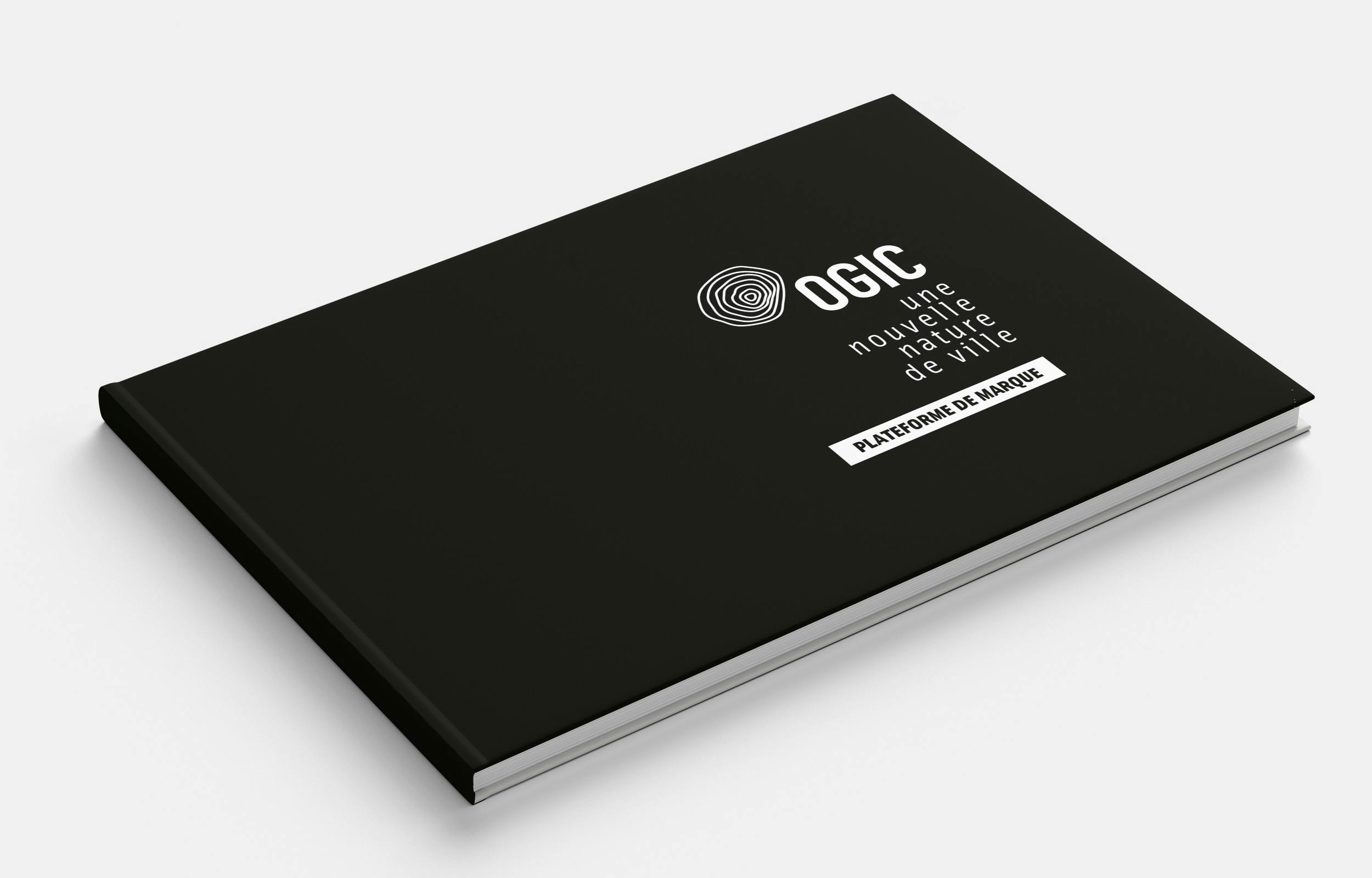
Redrafting the brand platform resulted in the signature: “The new nature of the city”. This served as a guiding light in developing a new visual identity, which had to be effortless, breezy and elegant. With a strong symbol: a logo made up of concentric circles, evoking both a map’s topographic contours and the footprints left by our cities, and representing the reconciliation between nature and architecture. We opted for a limited palette of blacks and whites, to accentuate elegance and symbolize innovation. This allowed the projects themselves to take center stage in the campaign, allowing the content to breathe. Because after all, it’s by redesigning lighting, materials and spaces that OGIC breathes fresh life into cities.
